| This text had
in mind following media (all with significantly different impression of
composition): mainly photography and film, then painting (including drawing
and graphic arts), all in different possibilities of presentation. With
all the respect to the three dimensional composition of sculpture and architecture,
these have been somewhat put aside, in regard to the importance
of frame for this study. For the same reason, the theater (including the
dance, and opera), often can be interpreted in relation to the frame,
conditional to the traditional division between the stage and auditorium,
and created direction of sight. I will happily spare you from the tedious description of every mentioned medium and its specifics. What matters the most is the level of abstraction they use, similarities and dissimilarities in how they translate the reality. What we so far missed to address is the context, circumstance of our contact with an image and how it influences the composition as we see it. A painting, drawing or photograph can be found on the floor of a studio, or printed in a book, or perhaps in the magazine folded in our pocket. Not going into what print reproduction can do to an image, or the obvious influence of the magazine layout, there is one fundamental difference between having this image in our hand, and standing in front of it hung on the gallery wall. There is a difference of relation - between something as intimate as our pocket, and as pompous as the Louvre wall. Besides, the image on the wall is firmly anchored in the specific spatial orientation. That's why the hanging is so important: mostly in relation to the other images, and then of course to the interior design and architecture of the place - a "neutral spot" is a myth. This is a serious quest if our mission is to allow every image its complete, undisturbed and autonomous life. The size of image belongs in the same category. This is not only the physical size, but everything influencing the angle of view: mainly our distance from it, somewhat arbitrary in the gallery, but more determined in the printed form, and completely by the theater row (or the distance between the sofa and TV). Size of an imaginary field perceived as a whole is what's at stake here. While a post stamp can hardly be observed as else but an indivisible whole, let's just imagine standing close to a huge mural: perception is reduced to collecting individual elements that only our imagination can join. Every image has only one best distance for the observation; there is only one "right" row in the theater: it is the one where we are still capable of feeling the whole - but already have the insight into the smaller relations inside it. Emotionally, the loss of the perception of whole feels like a certain fall in the gaps of space in the image: maybe that's what the cinema front row addicts are looking for? It is also interesting how much of a difference there is between the hanging and projection of the same image - mostly by changing the character of frame. The best example is a photograph on the wall, and the same projected as a slide. First to be noticed is a different relation of the image with the background surface. Viewing the image that's lit by the same light as our surrounding just isn't the same as looking at the image which glows at us from the all-encompassing darkness. The mentioned spatial orientation difference aside, the isolation of a projection also closes in on the illusion of reality, thereby shifting the level of abstraction, and especially the importance and strength of frame. Projection makes the image more real, so empathy becomes relation, two dimensions unfold into three, and the all mighty "edge of the world" becomes only a window into one, thus disarming a number of compositional elements and forces. It is by now also clear that I do not absolutely favor sharpness: its level is a fundamental attribute of image, often subconsciously perceived, and characteristically different among mediums. The standard of sharpness is established not only by the technical limitations, but also by the subjective average, eyesight capacities, and also the viewing situation. What we didn't yet mention is the influence of time on composition observed in basic difference between photography and motion picture. The absence of the time flow, timelessness, is always perceived as a sort of liberation in eternity - so we take the immobile composition just like that: once for all, without expecting a change. Introduction of the time element has different consequences. For example, an unstable or even dynamic composition will have a harder time establishing its essential feeling: it will all too easy slip into a simple expectation of change, if we know that the change is possible. The duration of the film take in relation to the amount of information present is a (very interesting) subject for a whole book (which has been a published dissertation of my dear late professor Ante Peterlic, and can be found in bibliography at the end). |
|||
| differences among the media | |||
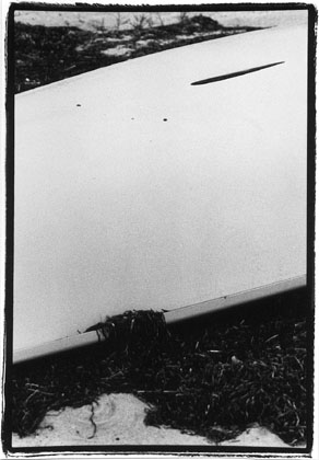
Size of the image is particularly important here, because of the relation of two distant and equally important elements. The space between them changes relative to the image size: from the right distance, it's shapeless void will give the appropriate tension to the mentioned relation. That same shapelessness will swallow the viewer if we enlarge the image, or, 0or example, look at it with one eye from the 2" distance. |
|||
   |
|||