| We could start exploring the colors
and shades of gray in the same manner we did with previous subjects in the relation of a medium with reality it represents.
Sorting out the combination of similarities and differences between the
two usually makes one aware of what is essential about the medium itself.
This procedure also yields an estimated abstraction level characteristic
for the medium, so we'd end up reasoning how the color certainly brings
up new creative possibilities, but on the other side it lowers that abstraction
level - making everything closer to reality. That business being done, let's indulge in a far more satisfying comparison: of the perception of color vs. shape. The sole act of perceiving a shape depends on an active approach, moving on the conscious and rational plane, and it has been attributed with masculinity. Perception of color, on the other hand, has something feminine about it, immediatelly communicating with our subconscious and intuitive. We have to stress that this concerns only the primary physiological pathways, not the further interpretation. From this point, we have to realize that a complete range of color descriptions would result in an impractical quantity of words, pages or even books: we are talking about a full spectrum of symbols with an unimaginable capacity. However, a strict organization into essence is equally impossible for the opposite, qualitative reason. So trapped, let's just settle for a little subjective-imperfect walk from the "bottom" part of the spectrum. The pure red color, uncontaminated by yellow, has the attributes of huge, but controlled energy in a static shape without apparent expansion or contraction, movement towards or away from the eye. The borders of red object are very strong, keeping the burning power in natural discipline. Going ever so slightly towards yellow, thru the orange-red, with the peak in reddish-orange, what happens is the barrage of phenomena usually attributed to the warm part of a spectrum. All of these colors are aggressively expanding and moving towards the viewer, bathing us in radiance of warmth with no much concern for anything, the least being it's origin. This is the dispersion of extroversion. In the analogy of shapes and colors (by Bauhaus), red is fitted with the shape of circle; for the yellow, appropriate is the triangle, the most dynamic shape, also suggesting the division point. For in the cold, poor, gaunt yellow (appearing a tad green), the beginning of cold spectrum can be sensed. This whole part of spectrum towards the green corresponds greatly with mental diseases, since the introvert blue is disturbed by the neurotic content of yellow - matching the internal conflicts of the burdened and hermetic mind (regardless of our habitually peaceful response to foliage). The more we approach the blue, the more that neurosis becomes controlled. Blue is completely cold, peaceful and serene color, inspiring thought. "A delightful nothing" (Goethe), blue concentrically retires into itself and away from us - into the concentration and foundation. It responds to shape of a square, settled and stabile, and symbolizes the absolute introversion and spiritual clarity. At the end of spectrum, in violet, a completely different energy can be found (oddly opposite to green in the psychological sense), with a lot in common with magical and transcendent. This light but penetrative color may owe its powers to connecting the ends - blue and red, being exactly an octave higher (of double frequency) from red, and inheriting some of its mystical strength. It is easy to see that how these (personal, did we say?) walks have little exactness, if only because of the incompatibility of language and color we can only reach as far as free rambling. It is still easier to write about the shape... A quick judgment will determine the black and white image to be an opposite
of color, and absence of the emotional content the color carries. However, the absence of color still doesn't free the ground for the pure action
of shapes. The scale of gray tones hides a surprising kinship with the
color spectrum. |
|||
| color and tone | |||
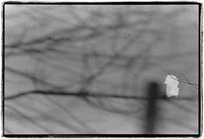
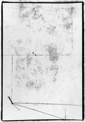
The mood of this image is largely determined by the tonality of wall and shadow. Both can obviously be controlled by varying contrast and brightness while enlarging. The darker midtones here describe a gentle tired flow from left to right, with the particular inclination towards our small lighter spot.
|
|||
   |
|||